

How to Add AI-Generated Multimedia to Your Content in 10 Minutes (With Real Prompts That Work)
Transform boring text into engaging visual content that search engines and users actually want to see.

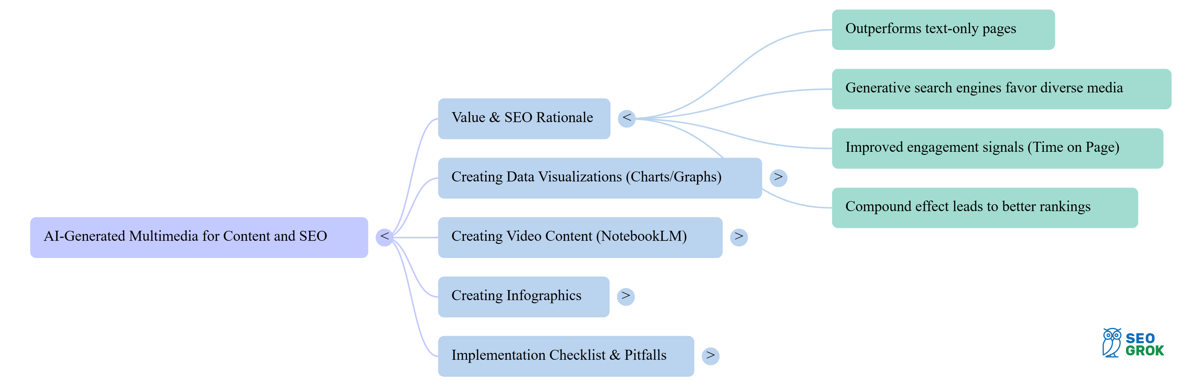
I’ve witnessed countless algorithm changes and ranking factor shifts. But one truth remains constant: content enriched with relevant multimedia consistently outperforms text-only pages. Today, I’m sharing a few practical AI techniques that will help you create compelling visual elements without hiring a design team or learning complex software.
Why does this matter for your SEO? Generative search engines (like Google’s AI Overviews and Perplexity) increasingly favour content with diverse media formats. If you’re not optimizing for these changes, you’re leaving rankings on the table.
Creating Data Visualizations That Google (and Users) Love
Let’s start with something every content creator needs: compelling charts and graphs. Instead of wrestling with Excel or paying for expensive visualization tools, you can generate professional data graphics in minutes.
Why Charts? Charts earn seconds you may otherwise have lost to the back button.
“Graphs can be processed up to 46% faster than tables—so adding a quick chart helps readers grasp your point before they bounce.” - ResearchGate
The Graph Creation Prompt That Works Every Time
Here’s a prompt to use with ChatGPT:
Prompt:
“Create a bar chart comparing [your data points]. Use these specific values: [list your data]. Make the chart clean and professional with clear labels. Include a title that says ‘[Your Title]’ and use colours that are accessible for colorblind viewers. Format as a table first.”
Example:
Let’s say I need to very simply visualize SEO ranking improvements for a client presentation, I could use:
“Create a bar chart comparing organic traffic growth across 4 quarters. Use these values: Q1: 12,000 visits, Q2: 18,500 visits, Q3: 24,200 visits, Q4: 31,000 visits. Make the chart clean with a title ‘Organic Traffic Growth 2024’ and use blue gradient colours. Format as a table first.”

The AI provided the formatted data table and step-by-step instructions for creating the chart in Google Sheets. Total time invested: 3 minutes. The result was simple, but accurate and a graphical cue for content. Sure, I could have created this with a spreadsheet, but not in 3 minutes.
Why This Matters for Rankings
Search engines can now understand and index chart data when properly formatted. By including the data table alongside your visual (which the AI prompt provides), you’re giving search engines structured information they can parse while providing users with an engaging visual experience.
Note: If you don’t want to embed the table, that’s perfectly fine. The chart itself will improve the look and feel of your content. If you’d prefer to include but hide the table because it is unsightly, you could always use an accordion-style layout and make the image in the first tab (open by default) and the table in the closed section; this way data that made up the chart is still available for crawlers. Sorry, I couldn’t demonstrate that within Substack.
Below is an alternative to using ChatGPT: using Graphy.app to generate a graph. You could just screenshot a simple free account chart designed in Graphy, but you would miss out on the interactivity of embedding the chart using Graphy’s embed code; the screenshot below shows what you see if you hover over a bar in an interactive Graphy chart.

Unfortunately, I couldn’t embed it because I don’t have a paid account. I haven’t tested to see if this interactivity includes the benefits of SEO friendliness, but it sure is a step up from a static graphic!
The thing is, you would need the data already in a table first, before being able to create the chart in Graphy, so it isn’t a 3-minute task, unlike ChatGPT.
Consider this a premium-tier option.
Turn Your Articles into Video Content with NotebookLM
Google’s NotebookLM recently launched a feature that should be in every content creator’s toolkit: automatic video creation from your existing content. This isn’t just text-to-speech; it creates engaging, narrated video overviews with visual elements.
Did you know? According to Wyzowl’s 2025 Video Marketing Statistics report, 89% of businesses now use video as a marketing tool, with 82% of video marketers reporting that video has helped them increase web traffic.
How to Use NotebookLM’s Video Overview Feature
Upload your article or document to NotebookLM
Click on “Generate Video Overview”
Wait 5-20 minutes for processing.
Download the video for embedding in your content.
The system automatically identifies key points, creates relevant visuals, and adds professional narration.
As a perfect example, I utilized NoteboookLM to create a video of this very article.
It isn’t perfection, but it’s definitely close enough.
NotebookLM Video Placement Tips
Position these videos strategically within your content. I’ve found the best placement is after your introduction (to hook visual learners) or as a summary at the end. If you can, include a link to a text transcript below the video for accessibility and additional SEO value.
Remember to optimize your video file names and add proper schema markup. Search engines can’t watch videos, but they can read the metadata and surrounding context you provide.
Creating Infographics from Existing Content
Your best-performing articles are goldmines for infographic creation. Instead of starting from scratch, use AI to transform your existing content into shareable visual assets.
Why Infographics? When shoppers compare options, visuals win. Infographics turn skim into understanding.
58% of B2B buyers say infographics are among the most valuable content types in the early stage of the buying journey (up from 42% the year prior). src. DemandGen
61% of consumers say infographics help them retain information better.
src DemandSage
The Infographic Generation Prompt
Master Prompt:
“Transform this article into an infographic outline with 5-7 key sections. For each section, provide: 1) A compelling header, 2) 2-3 bullet points with specific data or tips, 3) Suggested icon or visual element. Keep text minimal and focus on the most impactful information. Format this so I can easily input it into Canva or Piktochart.”
Working Example:
I asked Piktochart.com to create an infographic based on the content in this article. Here is the process I used:
I created a free account and clicked on the AI generator option.
I selected the tab where I can paste my article content, then, in the additional notes section, I said I wanted it to create an infographic based on this article’s title (I pasted the title there).
I chose a style and immediately was able to see how the infographic would look with my content.
I downloaded it. And below is the result.

Now, this infographic is exceedingly basic… it only basically, and literally, qualifies as an infographic. If I really wanted this to be an infographic worth sharing, I would first use AI to generate the ideal data for Piktochart to build with. Here is what I might use for a complex audit I did and wanted to share with the world:
“Transform this technical SEO audit process into an infographic with 6 sections: Site Speed, Mobile Optimization, Crawlability, Content Quality, Link Profile, and Technical Health. For each section, extract the most critical action items and one key statistic.”
The AI would then produce a perfectly structured outline that I could drop into Piktochart’s AI infographic maker. With data so well structured, the infographic quality would be much higher if I had a paid account.
Distribution Strategy for Infographics
Don’t just embed the infographic and forget about it. Create multiple versions:
Full-size for your article
Square format for Instagram
Horizontal layout for LinkedIn
Individual sections as carousel posts
Each version extends your content’s reach and creates additional indexable assets for search engines. You just might have to pay for a pro account at Piktochart, or your infographic creator of choice, to do this.
BONUS TIP: NotebookLM can also create mindmaps in seconds. They are super cool and easy to fan out in any way you wish. When you get to a place you like, you can easily download a snapshot and post it to your article. Here is an example:
Your Practical Implementation Checklist
Before you dive in, here’s your action plan:
Work on your top 10 performing articles - These are prime candidates for multimedia enhancement
Start with data-heavy content - Articles with statistics or comparisons work best for initial graph creation
Test NotebookLM on one article - Choose something 1,500-2,000 words for optimal video length
Create one infographic per month - Focus on evergreen content that will generate long-term value
Track engagement metrics - Monitor time on page, scroll depth, and social shares before and after adding multimedia
Common Pitfalls to Avoid
Through testing these approaches with dozens of clients, I’ve identified several mistakes that can sabotage your efforts:
Over-automation syndrome: While AI tools are powerful, don’t let them run wild. Always review and refine the output. I’ve seen catastrophic results when people blindly publish AI-generated charts with incorrect data labels.
Ignoring mobile optimization: That beautiful infographic might look stunning on desktop, but if it’s unreadable on mobile (where 60% of searches occur), you’ve wasted your time. Always test visual content on multiple devices.
Forgetting accessibility: Include alt text for all images, provide transcripts for videos, and ensure colour contrasts meet WCAG guidelines. This isn’t just good practice; it directly impacts your SEO performance.
The Competitive Advantage Nobody Talks About
Here’s what most SEO guides won’t tell you: multimedia content creates a compound effect. When you add relevant visuals, users spend more time on your page. This improved engagement signals to search engines that your content satisfies user intent. The result? Better rankings, which drive more traffic, which improves engagement metrics further.
I’ve watched clients move from page 3 to page 1 simply by enriching their existing content with appropriate multimedia elements. No link-building campaigns, no technical overhauls - just strategic visual enhancement using these AI tools.
Tools and Resources
For those ready to implement these strategies, here are the specific tools I recommend:
For Graphs and Charts:
Google Sheets for chart creation (free)
Graphy.app for more advanced visualizations
For Video Creation:
NotebookLM (free with Google account)
Video transcription: YouTube’s automatic captions
For Infographics:
Piktochart AI (free tier available)
Canva with Magic Design feature
Venngage AI generator: my test of this created a far more robust infographic, with many options for editing. I really liked it, but it would take a fair bit of editing to make it shareable, and it was nowhere near as graphical as Piktochart. Unfortunately, the better quality options that were graphical were not available for the free tier. All-in-all, though, I do believe this to be the better choice if you go premium.
Coming Soon: NotebookLM is apparently coming out with an infographics tool that will generate visuals from notes, but it has not yet been released. I hope this comes soon, since I’ve been very impressed with NotebookLM’s capabilities thus far.
Moving Forward
The gap between content with multimedia and text-only pages will only widen as search engines become more sophisticated. Generative search engines already show a preference for content that provides multiple formats and perspectives. By implementing these AI-powered techniques now, you’re positioning your content for both current and future search landscapes.
Start with one piece of content this week. Choose your best-performing article, add a data visualization using the prompts I’ve provided, and monitor the results. Once you see the impact (and you will), scale the approach across your content library.
Remember, the goal isn’t to add multimedia for its own sake. Every visual element should enhance understanding, improve user experience, or provide information in a more digestible format. When you achieve that balance, both users and search engines reward your efforts.
The tools are free, the prompts are proven, and the potential impact on your rankings is significant. What’s stopping you from transforming your content today?
I love this. AI is good and bad, but this is an awesome positive use case.